Peeking Inside the Black Box: A Guide to ‘Visualizing and Understanding Convolutional Networks’
In the world of deep learning, 2012 was the year of AlexNet, a model that revolutionized computer vision. While its performance was undeniable, why it worked so well remained a mystery. In 2013, Matthew Zeiler and Rob Fergus published their groundbreaking paper, “Visualizing and Understanding Convolutional Networks,” offering one of the first clear glimpses inside this ‘black box.’ Their work not only provided intuition about how these models learn but also used that intuition to build even better networks. In this post, we’ll take a deep dive into this seminal paper, breaking down their techniques and discoveries section by section.
Abstract
Setting the Scene: The Post-AlexNet World
To understand the importance of this paper, we need to rewind to 2012. A Convolutional Neural Network (CNN) called AlexNet (cited here as Krizhevsky et al., 2012) had just achieved a groundbreaking victory in the ImageNet competition, a massive challenge to classify millions of images into 1000 different categories. AlexNet didn’t just win; it blew the competition out of the water, lowering the error rate by a staggering 10% from the previous best. This was the moment deep learning truly arrived in computer vision.
However, a huge problem remained. While researchers knew that AlexNet worked, they didn’t really know why. It was a “black box.” The network contained millions of parameters, and its internal workings were a mystery. This is the exact problem Zeiler and Fergus identify in their opening sentence: there was “no clear understanding of why they perform so well, or how they might be improved.” Without this understanding, improving models would be a slow process of trial and error.
The Mission: Understand and Improve
The authors lay out a clear, two-pronged mission:
- To Understand: Develop a technique to visualize the inner workings of a CNN. Specifically, they want to see what kind of features the “intermediate layers”—the hidden layers between the input image and the final output—are learning.
- To Improve: Use the insights from these visualizations as a diagnostic tool to identify problems in existing models (like AlexNet) and build better ones.
This is a classic scientific approach: develop a better measurement tool, use it to understand a phenomenon, and then use that understanding to produce a better outcome.
The Key Contributions
The abstract concisely summarizes the paper’s major achievements, which we’ll explore in detail later:
- A Novel Visualization Technique: They introduce a new method (which we’ll learn is a “Deconvolutional Network” or “deconvnet”) to see what excites the neurons in any layer of the network.
- State-of-the-Art Performance: They use this technique to tweak the AlexNet architecture, resulting in a model that surpasses its performance on ImageNet. This is a powerful proof-of-concept; their tool isn’t just for making cool pictures—it leads to tangible improvements.
- Ablation Studies: They conduct experiments where they systematically remove parts of the network to analyze which layers are most critical for performance. An ablation study is a common way to understand the role of different components in a complex system.
- Proof of Generalization (Transfer Learning): In a truly significant finding, they show that the features learned on ImageNet are not just useful for that specific task. By taking their pre-trained model and only retraining the final classifier layer on new datasets (Caltech-101 and Caltech-256), they achieve state-of-the-art results. This demonstrates that the deep layers of the network learn a rich, general-purpose representation of visual features that can be transferred to other tasks.
1. Introduction
The Resurgence of Convolutional Networks
Here, the authors ground their work in history. Convolutional Networks (or CNNs/convnets) weren’t a new invention in 2013. They were famously used by Yann LeCun back in 1989 for recognizing handwritten digits (the LeNet architecture). However, for many years, other machine learning techniques like Support Vector Machines (SVMs) dominated the computer vision field.
The authors point out that this has changed dramatically in the “last year” (i.e., 2012). They specifically highlight the watershed moment: the AlexNet paper (Krizhevsky et al., 2012), which didn’t just win the ImageNet competition, but won by a colossal margin (16.4% error vs. the runner-up’s 26.1%). This result was so decisive that it single-handedly shifted the entire field’s focus back to neural networks.
They then explain why this resurgence was happening now. It wasn’t just a better algorithm, but a perfect storm of three key factors:
- Big Data: Datasets like ImageNet provided millions of labeled examples, enough to feed the data-hungry appetite of deep networks.
- Powerful Hardware: The rise of GPUs (Graphics Processing Units) made it feasible to train these massive models in weeks instead of years.
- Smarter Algorithms: New techniques like Dropout were developed to prevent overfitting. Overfitting is when a model learns the training data too well (memorizes it) and fails to generalize to new, unseen data. Dropout is a regularization technique that randomly deactivates neurons during training, forcing the network to learn more robust and less co-dependent features.
From Black Box to Glass Box
This is the core motivation of the paper. The authors argue that simply getting good results isn’t enough; scientific progress requires understanding. Relying on “trial-and-error” to design networks is inefficient and unscientific. Their goal is to move beyond this by creating tools to peer inside the network.
They propose two main techniques:
- Deconvolutional Network (Deconvnet): This is the star of the show. A deconvnet is essentially a CNN run in reverse. While a CNN takes an image and maps it to features, a deconvnet takes the features from a specific layer and maps them back to the input pixel space. The result is an image that shows which patterns in the original input caused a particular neuron (or “feature map”) to activate strongly. It answers the question: “What is this part of the network looking for?”
- Occlusion Sensitivity Analysis: This is a simple but clever complementary technique. The idea is to systematically block out different parts of the input image (e.g., with a gray square) and watch how the classifier’s confidence changes. If the probability of the correct class drops sharply when a certain area is covered, it means that area was very important for the decision. This helps confirm whether the model is looking at the object itself or just using surrounding context.
The Research Roadmap
Finally, the authors lay out their plan. They will first apply their visualization tools to the famous AlexNet architecture. By “diagnosing” it, they will identify architectural weaknesses and propose specific changes to fix them, leading to a new, better-performing model.
Then, they will tackle a fundamental question: are the features learned by this network only good for ImageNet, or are they universal visual features? They test this by taking their ImageNet-trained network, freezing all the convolutional layers, and only training a new final classifier for different datasets. This concept is now known as transfer learning.
They explicitly contrast their approach of supervised pre-training (learning features on a large, labeled dataset like ImageNet) with the then-popular unsupervised pre-training methods. Their work helped establish that supervised pre-training on a massive dataset is an incredibly effective strategy, forming the basis for how most computer vision models are built today.
1.1. Related Work
Before introducing their own technique, the authors provide a concise overview of previous attempts to visualize neural networks. This isn’t just an academic formality; it’s a way of building a case for why their new method is necessary. They essentially map out the landscape of existing tools and point to the specific gap they intend to fill.
The Challenge of Visualizing Deep Layers
Visualizing features to gain intuition about the network is common practice, but mostly limited to the 1st layer where projections to pixel space are possible. In higher layers this is not the case, and there are limited methods for interpreting activity.
The authors start by stating a well-known fact: visualizing the very first layer of a CNN is relatively easy. The filters in the first layer are applied directly to the input image pixels. This means you can just plot the filter weights as a small image and see what they’re looking for—typically simple patterns like colored blobs, edges, and gradients.
The real challenge, which no one had really solved yet, was visualizing the higher layers. A filter in, say, layer 3 isn’t looking at pixels; it’s looking at the output of layer 2. So, how do you translate what that layer 3 filter has learned all the way back into something a human can understand in the original pixel space? This is the core problem. They then review two main classes of prior attempts.
Attempt 1: Synthesis via Optimization
(Erhan et al., 2009) find the optimal stimulus for each unit by performing gradient descent in image space to maximize the unit’s activation. This requires a careful initialization and does not give any information about the unit’s invariances.
- What is it? This approach tries to generate a synthetic image from scratch that perfectly activates a chosen neuron. Imagine you have a neuron you want to understand. You start with a blank image of random noise and then use an optimization algorithm (like gradient descent, but in reverse—gradient ascent) to iteratively tweak the pixels of this image until they cause the neuron to fire as strongly as possible. The final image is the “optimal stimulus” for that neuron.
- The Critique: The authors point out two major flaws:
- It’s finicky: The process is sensitive to the initial random noise image you start with. It’s like trying to find the highest peak in a mountain range by starting at a random spot; you might just find a small local hill instead of the main summit.
- It doesn’t show invariances: This method produces just one perfect image. But a robust feature detector should be invariant to small changes. For example, a “dog face” detector should fire for dogs of different breeds, sizes, and orientations. This optimization method doesn’t tell you anything about this range of acceptable inputs; it just shows you one ideal-looking one.
Attempt 2: Probing Invariances Mathematically
Motivated by the latter’s short-coming, (Le et al., 2010) (extending an idea by (Berkes & Wiskott, 2006)) show how the Hessian of a given unit may be computed numerically around the optimal response, giving some insight into invariances. The problem is that for higher layers, the invariances are extremely complex so are poorly captured by a simple quadratic approximation.
- What is it? This work tried to solve the invariance problem. Instead of just finding the peak activation (the “optimal stimulus”), they also tried to understand the shape of the peak. A very sharp, narrow peak means the neuron is highly specific, while a broad, flat peak means it’s invariant to a wider range of inputs. They did this by computing the Hessian, a mathematical tool that describes the curvature of a function.
- The Critique: This is a clever idea, but the authors argue it’s too simplistic. The Hessian provides a quadratic approximation—it assumes the activation landscape around the peak looks like a simple bowl (either upright or upside down). For the simple features in early layers, this might be okay. But for a complex, high-level feature like “bird,” the set of all possible inputs that trigger the neuron is vastly more complex and can’t be described by a simple shape. The approximation is just too crude to be useful.
1. Gradient vs. Hessian
Gradient = the slope.
- Tells you the direction of steepest increase or decrease.
- Example: If you drop a ball on a hill, the gradient points where it will roll.
Hessian = the curvature.
- Describes how the gradient itself changes.
- Tells you the shape of the hill: sharp peak, flat bump, or something tilted.
- Mathematically, it’s a matrix of all the second derivatives of the function.
👉 In short: The Hessian is the derivative of the gradient.
2. Intuition with a Hill 🏔️
Stand on top of a hill:
The gradient tells you which way is downhill.
The Hessian tells you whether the hill is:
- Sharp & pointy (big curvature → very selective),
- Wide & flat (small curvature → tolerant/invariant),
- Or curved differently depending on direction.
3. Why It Matters for Neurons 🧠
A neuron’s “optimal stimulus” is like the peak of a hill where it activates the most.
The Hessian around that peak describes how sensitive the neuron is:
- Sharp peak → neuron fires only for very specific inputs.
- Flat peak → neuron fires for a wide variety of inputs (more invariant).
✅ Summary:
- Gradient = slope (where to move).
- Hessian = curvature (how the slope changes).
- Useful for probing invariances in neurons, but too simplistic for complex, high-level features.
Attempt 3: Finding Real-World Examples
(Donahue et al., 2013) show visualizations that identify patches within a dataset that are responsible for strong activations at higher layers in the model. Our visualizations differ in that they are not just crops of input images, but rather top-down projections that reveal structures within each patch that stimulate a particular feature map.
- What is it? This is a much more direct and intuitive approach. Instead of generating a synthetic image, you just feed thousands of real images from your dataset into the network. For a neuron you’re interested in, you keep track of which image patches made it fire the most. You then display the top 9 or so patches. This shows you what the neuron is detecting “in the wild.”
- The Critique: The authors acknowledge this is a good approach, but they point out a subtle but critical limitation. This method shows you the entire rectangular patch that caused the activation. But what within that patch was the key stimulus? Was it the whole object? An eye? A bit of texture? You can’t be sure.
- Their Point of Difference: This is where Zeiler and Fergus set up their own method. They state that their visualization will be different. It’s not just a crop of the input image. It’s a “top-down projection” that starts from the neuron’s activation and reconstructs only the pixel pattern that caused it to fire. This allows them to isolate the specific structure within the patch that the neuron is actually sensitive to, which is a much more precise and revealing form of visualization.
2. Approach
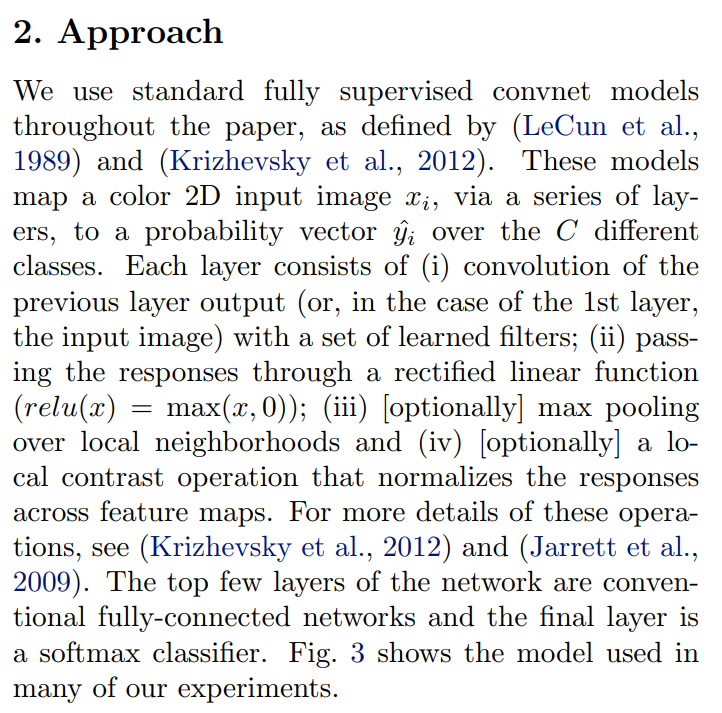
The authors begin by stating that they aren’t reinventing the wheel. They are studying the “standard” CNN architecture of the time, building directly on the work of LeCun (LeNet) and Krizhevsky (AlexNet).
The goal of this entire system is to take an input image (denoted as xi) and produce a probability vector (denoted as ŷi). A probability vector is simply a list of numbers, one for each possible class (e.g., ‘dog’, ‘cat’, ‘car’), where each number represents the model’s confidence that the image belongs to that class. These numbers all add up to 1.
They then break down the anatomy of a typical “layer” in the convolutional part of the network into its key operations. Let’s look at each one:
Convolution: This is the core operation of a CNN. The network learns a set of filters (also called kernels), which are small matrices of weights. Each filter is specialized to detect a specific pattern, like a vertical edge, a green blob, or a more complex texture. The filter “slides” across the input from the previous layer, and at each position, it computes a dot product. This produces a feature map, which is essentially a 2D grid showing where in the input the filter’s specific pattern was found.
ReLU Activation (Rectified Linear Unit): After convolution, the feature map is passed through an activation function. In classic neural networks, functions like sigmoid or tanh were common. However, AlexNet popularized the use of ReLU, defined as
f(x) = max(0, x). It’s a remarkably simple function: if the inputxis positive, it passes it through unchanged; if it’s negative, it becomes zero. This simple operation helps with training speed and prevents gradients from vanishing, a common problem in deep networks. It acts as a “gate,” only allowing signals from strongly detected patterns to pass forward.Max Pooling: This is a downsampling operation. The feature map is divided into a grid of small regions (e.g., 2x2 pixels), and within each region, only the maximum value is kept. This has two key benefits:
- It reduces the spatial dimensions of the feature maps, making the network computationally cheaper and reducing the number of parameters.
- It provides a small amount of local invariance. By taking the max value in a 2x2 region, the network becomes less sensitive to the exact location of the feature. A vertical line detected at position (5,5) or (5,6) might both result in the same max-pooled output, making the network more robust.
Local Contrast Normalization: This was a technique used in AlexNet but has since fallen out of favor and been largely replaced by Batch Normalization. The idea was to normalize the response of a neuron based on the activity of its neighbors across different feature maps. Think of it like adjusting the contrast in a photograph to make certain features stand out more clearly relative to their surroundings.
Finally, after several of these convolutional layers, the feature maps are flattened into a long vector and fed into a few fully-connected layers, which are the “classic” neural network layers where every neuron is connected to every neuron in the previous layer. The very last layer is a softmax classifier, which takes the final set of numbers (logits) and squashes them into the clean probability vector we discussed earlier.
Figure 3: A Visual Blueprint of the Network Architecture
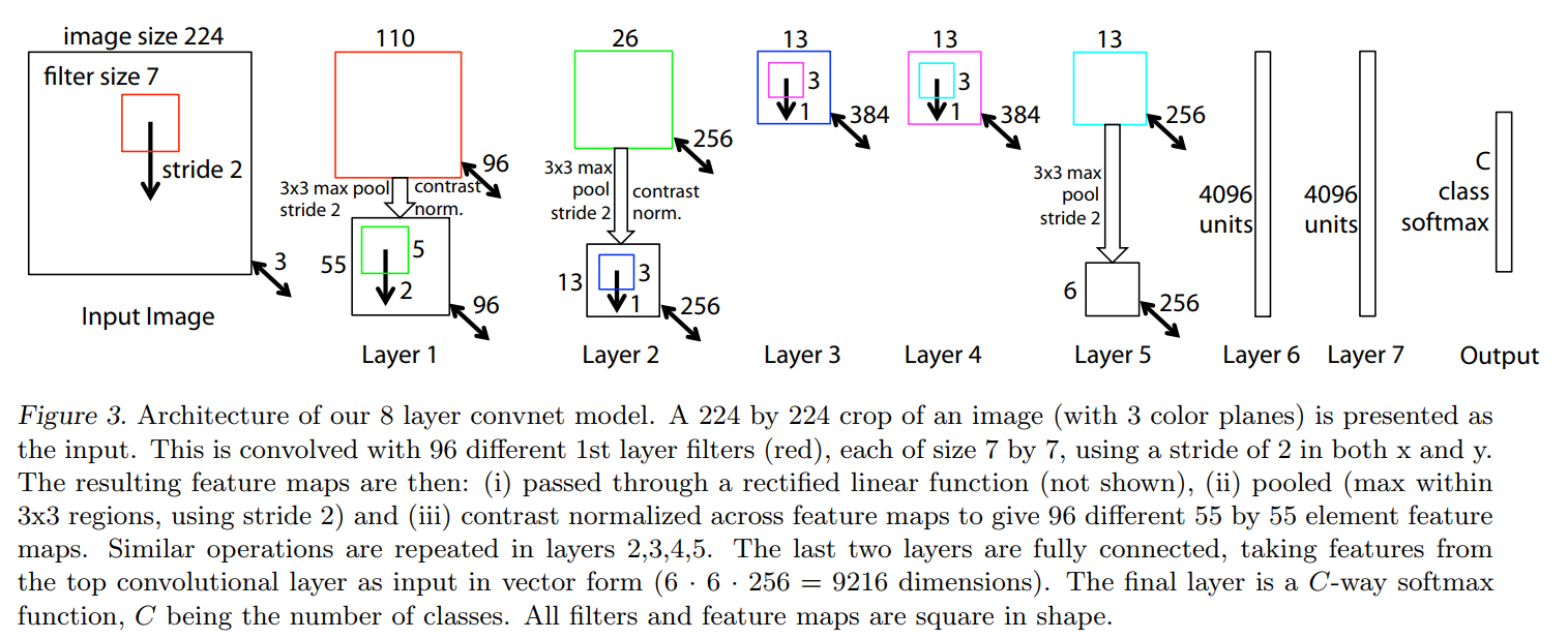
This diagram shows the end-to-end journey of data through their 8-layer network, which is a modified version of AlexNet that they will later refer to as “ZFNet”. Let’s walk through it, from input to output.
Input: The process starts with a 224x224 pixel image with 3 color channels (Red, Green, and Blue). This is the standard input size for models competing on the ImageNet dataset.
Convolutional Layers (Layers 1-5): This is the feature extraction part of the network.
Layer 1: The input image is hit with 96 different filters, each
7x7pixels in size. A stride of 2 means the filters jump 2 pixels at a time as they scan across the image. This convolution step reduces the spatial dimensions significantly, resulting in an intermediate feature map of size110x110, as indicated by the number110and the red square in the diagram. This110x110map is then immediately processed by a3x3max pooling operation (also with a stride of 2), which halves its size again. The final output of Layer 1 is a stack of 96 feature maps, each55x55in size.- Key Idea: Notice the two-stage size reduction. The network is trading raw spatial information (
224x224) for a richer, more abstract feature representation (55x55x96).
- Key Idea: Notice the two-stage size reduction. The network is trading raw spatial information (
Layer 2: This layer takes the
55x55x96block of features from Layer 1 and applies 256 different filters to it. Following convolution (which produces the26x26intermediate maps) and pooling, the output is a13x13x256block. The pattern continues: the spatial size shrinks, and the feature depth grows.Layers 3, 4, 5: These layers continue to process the features. An interesting architectural choice is that Layers 3 and 4 do not have pooling layers. This allows the network to build more complex features at the same
13x13spatial resolution before the final pooling operation in Layer 5. The final output of the convolutional block is a stack of 256 feature maps, each6x6in size.
The “Flattening” Step:
- After Layer 5, we have a
6x6x256volume of highly abstract features. To feed this into a traditional classifier, it needs to be “unrolled” into a single, long vector. - The caption does the math for us:
6 * 6 * 256 = 9216. This single vector of 9,216 numbers represents the network’s high-level understanding of the input image.
Fully Connected Layers (Layers 6-7):
- These are the decision-making layers. The
9216-dimensional vector is fed into Layer 6, which has4096neurons. This layer can learn complex combinations of the features from the previous stage. For example, it might learn that “feature #12 (pointy ear)” + “feature #54 (whiskers)” + “feature #102 (fur texture)” is strong evidence for the “cat” class. - Layer 7 is another fully connected layer of the same size, which adds another level of reasoning.
Output Layer:
- The final layer is a softmax layer. It takes the
4096values from Layer 7 and transforms them into a probability distribution across allCclasses. For ImageNet,Cwould be 1000. The output is a list of 1000 numbers, each representing the model’s confidence for a specific class (e.g., “Golden Retriever: 92%”, “Tennis Ball: 3%”, “Computer Keyboard: 0.1%”, etc.), all summing to 100%.
How the Network Learns: The Training Loop
At the beginning of training, the network is essentially useless. All its adjustable parameters—the millions of numbers that make up the convolutional filters and the weights in the fully-connected layers—are initialized with random values. The process of “training” is the process of intelligently tuning these parameters so the network produces correct answers. The authors describe the standard three-step recipe for this process:
The Goal (Loss Function): First, we need a way to measure how wrong the network is. We feed it an image
xfor which we know the true labely(e.g., we know the image is a “cat”). The network makes its predictionŷ, a vector of probabilities. The cross-entropy loss function is a standard way to measure the “distance” between the predicted probability vectorŷand the true labely. If the network is very confident that the image is a “cat,” the loss will be low. If it confidently predicts “car,” the loss will be very high. This loss value gives us a single number that quantifies the model’s error for that specific example.The Signal (Backpropagation): Now that we have a measure of error, how do we use it to fix the network? This is the magic of backpropagation. Using calculus (specifically, the chain rule), we calculate the derivative of the loss with respect to every single parameter in the network. This derivative, also called the gradient, acts as a signal. For each parameter, its gradient tells us two things:
- The sign (positive or negative) tells us whether to increase or decrease the parameter’s value to lower the loss.
- The magnitude tells us how much that parameter contributed to the overall error.
The Update Rule (Stochastic Gradient Descent): Once backpropagation has given us the correct direction to nudge each of the millions of parameters, we use an optimization algorithm called Stochastic Gradient Descent (SGD) to actually update them. “Gradient Descent” means we take a small step in the opposite direction of the gradient, thereby “descending” the loss curve and making the network slightly less wrong. “Stochastic” means that instead of calculating the gradient over the entire dataset at once (which would be computationally massive), we estimate it using a small, random batch of images (e.g., 128 images).
This loop—predict, calculate loss, backpropagate, update—is repeated millions of times with different batches of images. With each iteration, the network’s parameters are gradually nudged into a configuration that minimizes the overall loss, turning the initially random network into a powerful image classifier.
2.1. Visualization with a Deconvnet
The Deconvnet: A Microscope for the Mind of a CNN
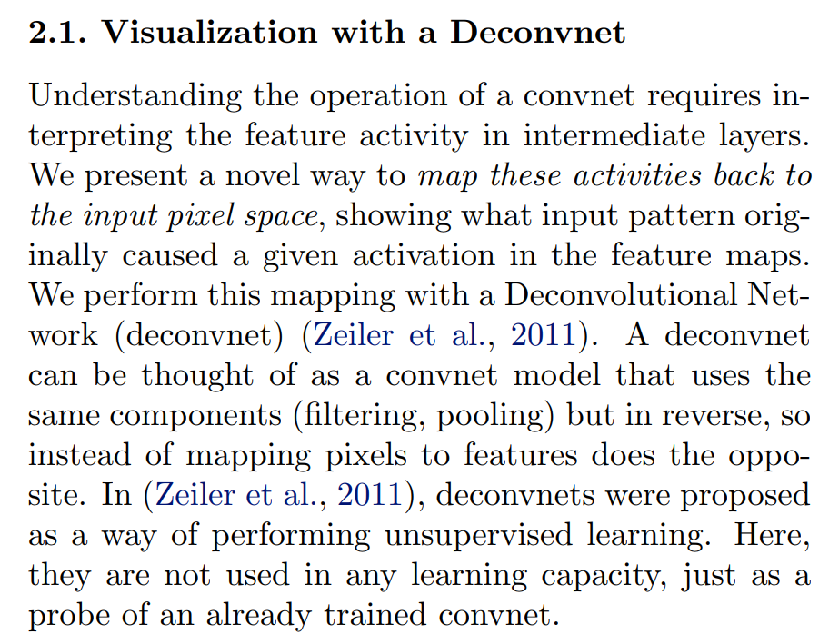
Having established the problem—that we can’t see what’s happening in the middle layers of a CNN—the authors now introduce their solution. The core idea is to find a way to map the abstract activity of a neuron backwards through the network, all the way to the input pixels, to see what kind of visual pattern excites it.
To do this, they introduce the Deconvolutional Network (Deconvnet).
A CNN in Reverse
The simplest way to think about a deconvnet is as a CNN that operates in reverse.
- A Convolutional Network (Convnet) takes a concrete input (pixels) and maps it to an abstract output (features). It answers the question: “What features are present in this image?”
- A Deconvolutional Network (Deconvnet) takes an abstract input (a feature map) and maps it to a concrete output (pixels). It answers the question: “What pixel pattern would create this specific feature?”
It achieves this by reversing the operations of a standard CNN layer. In the next section, we’ll see the exact mechanics, but conceptually, it will have to “un-pool,” “un-ReLU,” and “un-convolve” (or deconvolve) the signal to reconstruct the original pattern.
A Tool for Probing, Not for Learning
This is a critical and subtle point. The authors cite one of their own earlier papers (Zeiler et al., 2011) where deconvnets were first proposed. However, in that original work, the deconvnet was used for unsupervised learning—a way to learn features from unlabeled data.
Here, they are repurposing the tool for a completely different job. The deconvnet in this paper does not learn anything. It isn’t trained. Instead, it acts as a diagnostic probe that is attached to an already trained convnet. The deconvnet’s structure and parameters (the filters) are not learned independently; they are taken directly from the trained CNN, but flipped and used in reverse.
Think of the trained CNN as a complex piece of machinery. The deconvnet is like a specialized diagnostic tool you plug into different points of the machine to see what’s going on inside. It doesn’t change the machine’s operation; it just helps you visualize it. This distinction is crucial because it means the visualizations are a faithful representation of what the original network has learned.
The Visualization Process: From Feature to Pixels
Here, the authors lay out their four-step experimental procedure. Let’s imagine we want to understand what a specific neuron in Layer 3 is looking for. Here is how we would use their method:
Step 1: The Forward Pass First, we do a normal prediction. We take an input image (say, a picture of a cat) and feed it forward through the trained convnet. As the data passes through each layer, we save all the resulting feature maps. This gives us the raw material—the activations—that we want to investigate.
Step 2: Isolate a Single Neuron’s Activity Now, we choose the neuron (or entire feature map) in Layer 3 that we want to understand. Let’s say we pick the one that had the strongest activation from our cat image. To isolate its contribution, we take the entire output of Layer 3 and set all activations to zero, except for the single activation we are interested in.
This is a crucial step. By zeroing out everything else, we ensure that the visualization we generate is solely based on the signal from this one neuron. It’s like trying to hear a single violin in a recording of a full orchestra; the easiest way is to mute all the other instruments.
Step 3: The Backward Pass (Deconvnet Reconstruction) With our isolated feature map from Layer 3, we now pass it backward into the deconvnet. The deconvnet reverses the operations of the original network, layer by layer:
- (i) Unpool: It first reverses the max pooling operation from the forward pass. (We’ll see the clever trick for how they do this in the next section).
- (ii) Rectify: It passes the result through a ReLU activation function. This might seem strange, but the goal is to only reconstruct the positive, excitatory signals that caused the original activation. Applying ReLU here ensures that only positive feature signals are propagated backward.
- (iii) Filter (Deconvolve): It then applies a transposed version of the original convnet filters. This is the “deconvolution” step (more accurately called a transposed convolution) which projects the features back into the space of the previous layer (Layer 2).
Step 4: Repeat Until the End The output of this process is a reconstructed feature map for Layer 2. We then repeat Step 3: we unpool, rectify, and filter this Layer 2 map to reconstruct the activity in Layer 1. We do this again and again, stepping backward through the entire network, until we reach the very beginning and reconstruct an image in the original 224x224 pixel space.
The final image is the visualization. It shows us the specific pixel pattern that, when passed through the convnet, was responsible for exciting that single neuron we isolated back in Layer 3.
Now, let’s look at the specific details of how they reverse each of these operations.
Reversing the Flow: Unpooling, Rectification, and Deconvolution
To create a faithful reconstruction, the deconvnet must have a plausible inverse for each operation in the convnet. Here’s how they tackle each one.
Unpooling: Remembering Where the Signal Came From
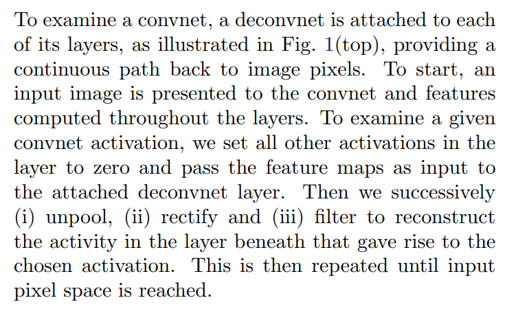
Unpooling: In the convnet, the max pooling operation is non-invertible, however we can obtain an approximate inverse by recording the locations of the maxima within each pooling region in a set of switch variables. In the deconvnet, the unpooling operation uses these switches to place the reconstructions from the layer above into appropriate locations, preserving the structure of the stimulus. See Fig. 1(bottom) for an illustration of the procedure.
The max pooling operation is inherently lossy. When we take a 2x2 patch of activations and keep only the maximum value, the information about the other three values and their positions is discarded. You can’t perfectly reverse this.
The authors’ solution is both simple and brilliant. Instead of trying to guess where the max value came from, they just remember.
- During the Forward Pass: As the convnet performs max pooling, it not only outputs the maximum value but also records the location (e.g., “top-left,” “bottom-right”) of that maximum within its local 2x2 region. These recorded locations are called “switches.”
- During the Backward Pass: The deconvnet’s unpooling layer receives a single activation. It looks up the corresponding switch to find out which location it originally came from. It then creates a larger feature map (e.g., 2x2) filled with zeros and places the activation at the recorded location.
This “unpooling” is a guided, non-uniform upsampling. By using the switches, the deconvnet preserves the spatial structure of the activation patterns. Without this, the reconstructed images would be a blurry mess.
Rectification: Focusing on the Positive
Rectification: The convnet uses relu non-linearities, which rectify the feature maps thus ensuring the feature maps are always positive. To obtain valid feature reconstructions at each layer (which also should be positive), we pass the reconstructed signal through a relu non-linearity.
This is a subtle but important point. The forward pass uses a ReLU (max(0, x)), which clips all negative values to zero. One might think the reverse operation should be something different, but the authors simply pass the signal through another ReLU during the backward pass.
The reasoning is philosophical: they are only interested in reconstructing the positive, excitatory signals that led to a feature being detected. The feature maps in the original network are, by definition (post-ReLU), always positive. Therefore, the reconstructions at each stage should also consist of only positive values to be considered “valid.” Applying a ReLU at each backward step enforces this constraint, ensuring that the visualization is built only from the parts of the signal that contributed positively to the final activation.
Filtering: The Transposed Convolution
Filtering: The convnet uses learned filters to convolve the feature maps from the previous layer. To invert this, the deconvnet uses transposed versions of the same filters, but applied to the rectified maps, not the output of the layer beneath. In practice this means flipping each filter vertically and horizontally.
The inverse of a convolution is an operation now commonly known as a transposed convolution (which this paper and others at the time referred to as deconvolution).
Here’s the key:
- Shared Filters: The deconvnet doesn’t learn its own filters. It uses the exact same filters that were learned by the convnet during its training. This is what makes it a “probe” of the original network.
- Transposed Operation: To project features from a smaller map back to a larger one, the filters are used in a transposed manner. As the paper notes, in practice this means taking the original filter and flipping it 180 degrees (both vertically and horizontally).
This flipped filter is then applied to the unpooled, rectified feature map to reconstruct the activity in the layer below, effectively reversing the original convolution and increasing the spatial resolution of the signal as it travels backward toward the pixel space.
Figure 1: The Deconvnet and Convnet as Mirror Images
This figure comes in two parts. The top is a high-level flowchart showing the symmetry between a convnet and a deconvnet layer. The bottom is a detailed illustration of the most clever part of the process: the “unpooling” operation.
Top: The Architectural Flowchart
This diagram places a convnet layer (right side) and a deconvnet layer (left side) side-by-side.
- The Convnet Layer (Forward Pass ↑): Reading from the bottom up, this is the standard process we’ve already discussed. An input (“Layer Below”) is processed by (1) Convolutional Filtering, (2) a ReLU function, and (3) Max Pooling to produce an output (“Pooled Maps”) for the next layer.
- The Deconvnet Layer (Backward Pass ↓): Reading from the top down, this is the reconstruction process. It takes an input from the layer above and inverts each step: (1) Max Unpooling, (2) a ReLU function, and (3) Convolutional Filtering with transposed filters (
F^T) to produce a reconstruction of the previous layer’s input.
The most important feature of this flowchart is the arrow labeled “Switches”. It shows that during the forward pass, the Max Pooling operation sends critical spatial information over to the deconvnet’s Max Unpooling stage. This is the link that allows the deconvnet to perform an intelligent, structure-preserving reconstruction.
Bottom: A Close-up on the Unpooling Mechanism
This is where we see the “switches” in action. Let’s follow the data:
- Start at
Rectified Feature Maps: Imagine this is a 4x4 grid of activations inside the convnet (after convolution and ReLU). For the pooling operation, this grid is divided into four 2x2 colored regions. The height of the bars represents the activation strength. - The
PoolingOperation: The network performs 3x3 max pooling with a stride of 2. In each colored 2x2 region, it finds the maximum value (the tallest bar) and keeps only that one. The result is thePooled Mapsgrid, which is now 2x2. - Recording the
Switches: Crucially, at the same time, the network creates theMax Locations "Switches"map. This map records the position of the maximum in each colored region. For the top-left green region, the max was in its top-right corner, so that location is marked (shown here as black). - The
UnpoolingOperation: Now we switch to the deconvnet. TheLayer Above Reconstruction(a 2x2 map) is the input to the unpooling stage. The unpooling operation creates a new, larger 4x4 grid. It then uses theSwitchesmap as a guide. It takes each activation from the input and places it in the larger grid at the location specified by the switch. For example, the activation from the green square is placed in the top-right corner of the green region. All other locations are filled with zero.
The final Unpooled Maps grid is the result. This is a brilliant “approximate inverse” of pooling. While it doesn’t recover the values that were lost, it perfectly recovers their spatial structure, which is essential for creating crisp, interpretable visualizations. Without this switch mechanism, the deconvnet would have to place the activation value in all four spots or guess, leading to a blurry and uninformative reconstruction.
Interpreting the Visualizations: What Are We Really Seeing?
After detailing the deconvnet’s mechanics, the authors pause to provide a crucial conceptual summary. Let’s unpack the three key ideas here.
Visualizations are Image-Specific, Not Generic. The use of “switches” has a profound consequence: the visualization for a feature is always tied to a specific input image. If a neuron is a “dog ear” detector, showing it an image of a beagle and an image of a german shepherd will produce two different visualizations. Both will highlight the ear, but the reconstruction will be in the shape and location of the beagle’s ear in the first case, and the german shepherd’s in the second. This is because the switches guide the reconstruction back to the original layout. This is powerful because it shows you what the feature detector saw in a specific context, not just a generic, “ideal” version of the feature.
They are Weighted Maps of Importance. The reconstruction is not a simple “cut-and-paste” from the original image. Instead, it’s a map showing which of the original pixels were most responsible for the neuron’s activation. The resulting image will have high intensity in the regions that were the primary stimulus and be dark or zero everywhere else. For example, if a high-level neuron fires for “human face,” its reconstruction will show the eyes, nose, and mouth brightly, while the cheeks, forehead, and background will be dim or black. The visualization is effectively a heat-map of importance.
They Reveal Discriminative Features. This is the most critical insight. The CNN was trained discriminatively—its sole purpose was to learn features that help tell classes apart (e.g., to distinguish a dog from a car, or a cat from a cupcake). Therefore, the features that it learns are, by definition, the most distinguishing characteristics of an object. When we visualize these features, we are seeing exactly what the model considers to be the most important, class-differentiating parts of an image. We aren’t just seeing what a “car” looks like, we are seeing the specific patterns (like wheels, windows) that the model learned to associate with the label “car” to separate it from all other labels.
Finally, the authors make a crucial technical clarification: these visualizations are reconstructions, not generated samples. A generative model (like a GAN) can create new, plausible images from scratch. The deconvnet cannot. It is a diagnostic tool that can only reconstruct the patterns from an image that has already been fed into the network.
3. Training Details
Before presenting their visualization results, the authors provide the exact recipe they used to train their network.
A Tweak to the AlexNet Architecture
We now describe the large convnet model that will be visualized in Section 4. The architecture, shown in Fig. 3, is similar to that used by (Krizhevsky et al., 2012) for ImageNet classification. One difference is that the sparse connections used in Krizhevsky’s layers 3,4,5 (due to the model being split across 2 GPUs) are replaced with dense connections in our model. Other important differences relating to layers 1 and 2 were made following inspection of the visualizations in Fig. 6, as described in Section 4.1.
The authors state their starting point is the famous AlexNet. However, they make a key simplification. The original AlexNet had a complex “split” architecture where half the feature maps were on one GPU and half on another. This was an engineering necessity: in 2012, no single GPU had enough memory (VRAM) to hold the entire model. Zeiler and Fergus, likely using slightly more modern hardware, were able to fit the model on a single GPU, allowing them to use standard, “dense” connections where all feature maps in one layer are connected to all feature maps in the next.
Crucially, they foreshadow their main discovery: they made other, more important changes to the first two layers, but these changes were not arbitrary. They were made after they used their visualization tool to diagnose problems with the original AlexNet design. This is the paper’s core thesis in action: understanding leads to improvement.
Data Preprocessing and Augmentation
The model was trained on the ImageNet 2012 training set (1.3 million images, spread over 1000 different classes). Each RGB image was preprocessed by resizing the smallest dimension to 256, cropping the center 256x256 region, subtracting the per-pixel mean (across all images) and then using 10 different sub-crops of size 224x224 (corners + center with(out) horizontal flips).
This paragraph describes a standard and powerful data preparation pipeline:
- Standardize Size: Images on the internet come in all shapes and sizes. They first resize every image so its shortest side is 256 pixels, then take a
256x256crop from the center. - Mean Subtraction: They calculate the average Red, Green, and Blue value for every single pixel location across the entire 1.3 million image dataset. Then, for each image, they subtract this average “mean image.” This technique, called mean normalization, centers the data around zero and is a crucial step that helps the training process (specifically, gradient descent) converge much more effectively.
- Data Augmentation: The network requires a fixed input size of
224x224. Instead of just taking one crop from the256x256image, they create 10 different versions: one from the center, one from each of the four corners, and then horizontal flips of all five. This is a vital form of regularization. It artificially expands the training set and teaches the model that an object’s identity is invariant to its position in the frame or its left-right orientation.
The Training Loop: Hyperparameters and Regularization
Stochastic gradient descent with a mini-batch size of 128 was used to update the parameters, starting with a learning rate of 10−2, in conjunction with a momentum term of 0.9. We anneal the learning rate through training manually when the validation error plateaus. Dropout (Hinton et al., 2012) is used in the fully connected layers (6 and 7) with a rate of 0.5. All weights are initialized to 10−2 and biases are set to 0.
This is the list of specific settings—the hyperparameters—for their training algorithm:
- Optimizer: They use Stochastic Gradient Descent (SGD) with a momentum of 0.9. Momentum helps the optimizer accelerate in the correct direction and avoid getting stuck in small, suboptimal local minima.
- Batch Size: They update the model’s weights after processing a mini-batch of 128 images.
- Learning Rate: The initial learning rate (the step size for each update) is set to
0.01. Critically, they perform learning rate annealing: when the model’s performance on a validation set stops improving, they manually decrease the learning rate to allow for more fine-grained adjustments. - Regularization: To prevent overfitting, they use Dropout in the two large fully-connected layers, randomly setting 50% of the neuron activations to zero during each training step.
- Initialization: At the start of training, the weights are initialized with small random values (
0.01) and the biases are set to0.
A Key Trick: Filter Normalization
Visualization of the first layer filters during training reveals that a few of them dominate, as shown in Fig. 6(a). To combat this, we renormalize each filter in the convolutional layers whose RMS value exceeds a fixed radius of 10−1 to this fixed radius. … We stopped training after 70 epochs, which took around 12 days on a single GTX580 GPU…
This is another fascinating example of using visualization to diagnose and fix a problem. By watching the filters evolve during training, they noticed that some of them were developing extremely large weights, effectively “dominating” the learning process and preventing other filters from learning useful features.
To solve this, they implemented a form of weight constraint. After each weight update, they would check the magnitude (specifically, the Root Mean Square value) of every filter. If a filter’s magnitude grew beyond a certain threshold, they would scale it back down. This forced the network to spread the learning across all its filters, leading to a richer and more diverse set of learned features.
Finally, they provide a humbling statistic: the entire training process took 12 days on a single NVIDIA GTX 580 GPU. This is a powerful reminder of the computational constraints of the time and how much hardware has progressed in the years since.
4. Convnet Visualization
This is the moment of truth for the deconvnet. Having built this sophisticated “microscope,” the authors now point it at their trained network to see what’s happening inside.
The Visualization Method: Showing Invariance
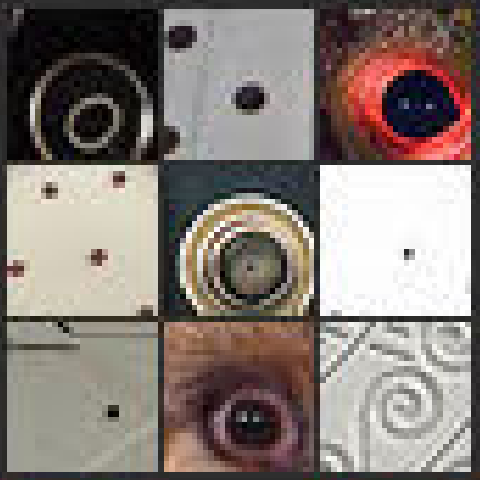
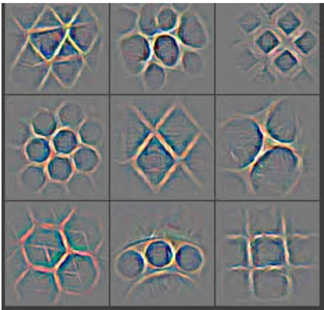
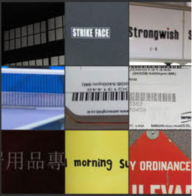
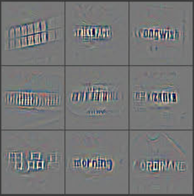
Feature Visualization: Fig. 2 shows feature visualizations from our model once training is complete. However, instead of showing the single strongest activation for a given feature map, we show the top 9 activations. Projecting each separately down to pixel space reveals the different structures that excite a given feature map, hence showing its invariance to input deformations. Alongside these projections we show the corresponding image patches. These have greater variation than visualizations as the latter solely focus on the discriminant structure within each patch. For example, in layer 5, row 1, col 2, the patches appear to have little in common, but the visualizations reveal that this particular feature map focuses on the grass in the background, not the foreground objects.
The authors make two clever methodological choices for presenting their results that are designed to extract the maximum possible insight:
Top 9, Not Top 1: Instead of just showing the single best image that activates a neuron, they show the top nine. This is a brilliant move. Why? Because it demonstrates the feature’s invariance. If a feature detector for “wheel” only ever fired on a perfectly side-on view of a specific tire brand, it wouldn’t be very useful. By showing the top nine activations, they can reveal that the feature detector fires for wheels at different angles, in different lighting conditions, and from different car models. It reveals the variety of inputs that the neuron considers to be the “same thing.”
Visualization vs. Raw Patch: For each of the top nine examples, they show two things side-by-side: the raw image patch that caused the activation, and the deconvnet reconstruction. This comparison is incredibly powerful. The raw patch shows you the full context, but the deconvnet visualization acts like a spotlight, revealing precisely what part of that patch the neuron was looking at.
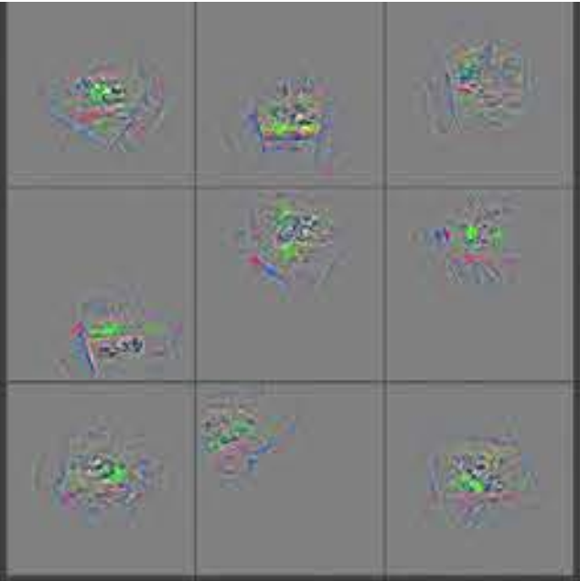
They provide a stunning example of why this is so important. For a particular feature in Layer 5, the top nine raw image patches looked completely unrelated. However, the deconvnet visualizations for all nine patches clearly showed a patch of green grass. The network had learned a “grass detector,” and it was ignoring the main objects in the foreground! Without the deconvnet, researchers would have been stumped as to what this feature was doing. With it, the answer is immediately obvious.
A Journey Through the Layers: The Visual Hierarchy
The projections from each layer show the hierarchical nature of the features in the network. Layer 2 responds to corners and other edge/color conjunctions. Layer 3 has more complex invariances, capturing similar textures (e.g. mesh patterns (Row 1, Col 1); text (R2,C4)). Layer 4 shows significant variation, but is more class-specific: dog faces (R1,C1); bird’s legs (R4,C2). Layer 5 shows entire objects with significant pose variation, e.g. keyboards (R1,C11) and dogs (R4).
This paragraph summarizes one of the most foundational discoveries in deep learning interpretability. When they applied their visualization technique to each layer of the network, a beautiful story emerged: the network learns a hierarchy of features, where each layer builds more complex concepts from the simpler concepts learned in the layer below.
Think of it like building with LEGOs:
- Layer 1 (not described here, but we’ll see it later): Learns the most basic primitives—the individual 2x2 bricks. These are simple colored blobs and edge detectors.
- Layer 2: Combines the edges from Layer 1 to create slightly more complex concepts like corners, curves, and junctions of different colors. These are like snapping a few bricks together to make a small, simple assembly.
- Layer 3: Assembles the corners and curves from Layer 2 into repeating patterns and textures. The visualizations show things like mesh patterns from a grill, honeycombs, or the patterns of text on a page.
- Layer 4: Begins combining these textures into meaningful object parts that are “class-specific.” It’s no longer just a generic “fur texture”; it’s now a “dog face” or a “bird’s leg.” The features are starting to have clear semantic meaning.
- Layer 5: The culmination of the process. This layer assembles the object parts from Layer 4 into detectors for entire objects, like a whole dog or a computer keyboard. Critically, these detectors are robust to pose variation, meaning they can recognize a dog from the side, from the front, or sitting down.
This was a landmark finding. It provided the first strong visual evidence that CNNs weren’t just memorizing random patterns, but were spontaneously learning a compositional, hierarchical model of the visual world, much like our own brains are theorized to do.
Figure 2: The Visual Hierarchy of a Trained CNN
This magnificent figure lays bare the internal workings of the network. Each row corresponds to a different layer, and within each row, several different feature maps (i.e., neuron types) are shown.
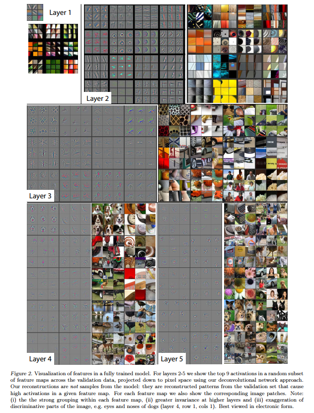
For each feature map in Layers 2-5, we see two blocks:
- Left Block: A 3x3 grid showing the top 9 deconvnet visualizations for that feature. These are the grayscale reconstructions that highlight the exact pixel pattern the neuron is looking for.
- Right Block: A 3x3 grid showing the corresponding raw image patches from the dataset that caused the strong activations.
Let’s take a journey up the hierarchy.
Layer 1: The Alphabet of Vision
In the top-left, we see visualizations for Layer 1. At this initial stage, the network learns the most basic building blocks of vision. We see two types of features:
- Color Detectors: Many filters are simple blobs of color (e.g., green, yellow, black).
- Edge Detectors: The majority of filters are what neuroscientists call Gabor filters—detectors for lines and edges at various orientations (vertical, horizontal, diagonal).
These are the fundamental “primitives” or the visual alphabet from which all other concepts will be built.
Layer 2: Learning Corners and Curves
In Layer 2, the network begins to combine the edges and colors from Layer 1. The features are noticeably more complex:
- We see clear corner detectors. The visualizations show a crisp L-shape, and the corresponding patches show this feature firing on window frames and box corners.
- We see arc and circle detectors. The visualizations show a circular pattern, and the patches show it activating on things like eyes, wheels, and dials.
- We see more complex conjunctions of lines and colors, like gratings or intersections.
This layer is learning the “words” of vision by combining the letters from Layer 1. The power of showing the top 9 activations is clear here: the “corner” detector fires on many different types of corners, demonstrating its invariance.
Layer 3: Discovering Textures
Layer 3 takes another leap in abstraction. By combining the corners and curves from Layer 2, it learns to detect textures and repeating patterns.
- We see a feature that detects honeycomb or mesh patterns (top-left). The patches show it activating strongly on car grilles and chain-link fences.
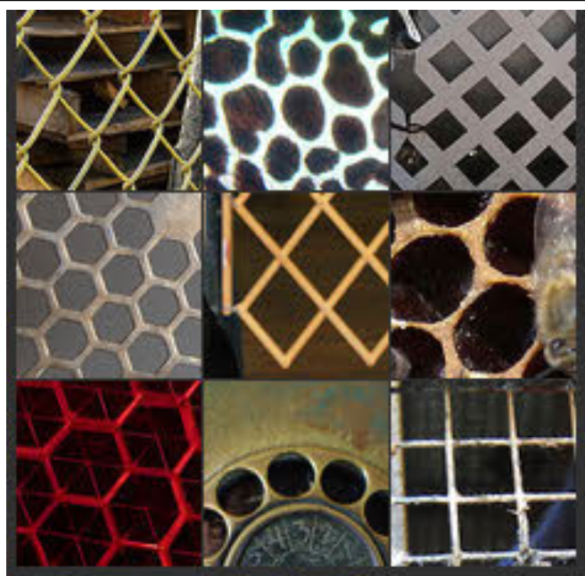
- Another feature (second row, fourth from left) appears to be a text detector, as it consistently fires on images containing letters.
- Other features respond to more natural textures, like fabric, foliage, or skin.
Layer 4: Finding Object Parts
This is where the features begin to have clear semantic meaning. The network is now combining textures and patterns from Layer 3 into recognizable parts of objects.
- The top-left feature is unmistakably a dog face detector. Notice how the nine visualizations consistently highlight the eyes, snout, and fur pattern, while the nine patches show a wide variety of dog breeds and poses.
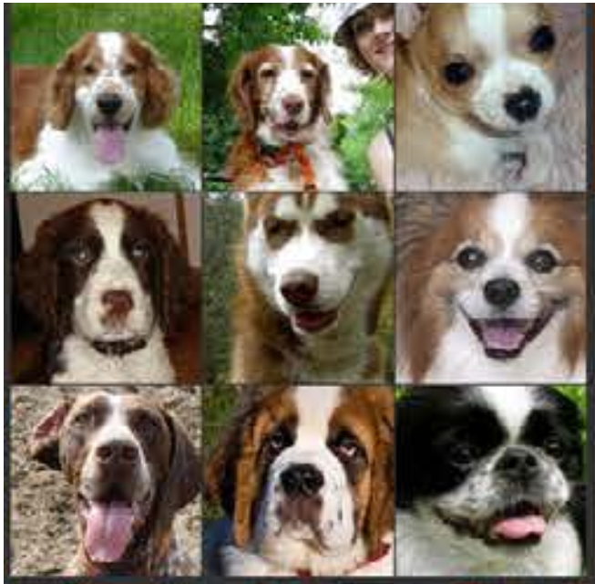
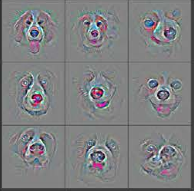
- Another feature (fourth row, second from left) has learned to find bird’s legs.
- We can see other features that appear to specialize in things like the wheels of cars or the ends of pointy objects.
The features are now class-specific, meaning they are strongly tied to the objects the network is trying to classify.
Layer 5: Recognizing Whole Objects
At the top of the convolutional hierarchy, Layer 5 assembles the object parts from Layer 4 into detectors for entire objects.
- We see features that respond to whole dogs, often with significant pose variation (fourth row).
- Other features detect flowers, keyboards, or people.
- The example the authors cited in the text is clear: one feature (top row, second from left) seems to fire on random objects, but the visualizations reveal it’s a grass texture detector, proving the diagnostic power of the deconvnet.
The key takeaway from Layer 5 is the immense invariance the network has learned. The “dog” detector can find dogs in different environments, poses, and lighting conditions. This is the hallmark of a robust, high-level visual representation. This figure provides the first truly compelling visual evidence of hierarchical feature learning in deep neural networks.
Feature Evolution during Training: Watching a Network Learn
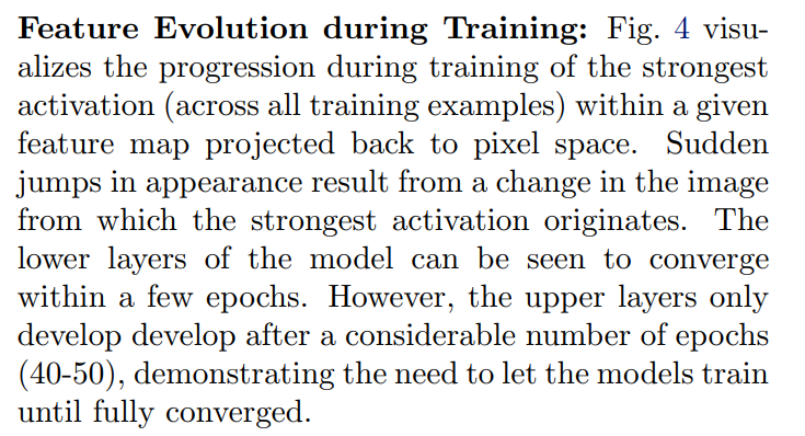
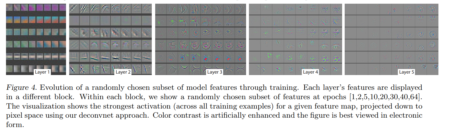
Here, the authors use the deconvnet as a dynamic diagnostic tool. They take “snapshots” of the network’s learned features at various points during the 70-epoch training process to answer the question: How do these complex features develop over time?
The “Time-Lapse” Experiment
For a given feature map (e.g., the “dog face” detector in Layer 4), they would periodically pause training (say, after every epoch) and perform a search. They would scan through the entire training set to find the single image patch that caused the strongest activation for that feature at that moment in time. They would then visualize this strongest activation using the deconvnet. The result is a visual timeline showing how a feature’s preference evolves.
The authors note that the visualizations can make “sudden jumps.” This happens when the feature refines its understanding and finds a new image in the dataset that is an even better example of what it’s looking for. The visualization then “jumps” to resemble this new, better stimulus.
The Two-Speed Learning Process
This “time-lapse” visualization revealed a fundamental insight into how deep networks train:
Lower Layers Learn Fast: The features in the early layers (Layers 1 and 2) “converge” very quickly, within just a few epochs. This makes intuitive sense. The basic building blocks of vision—edges, corners, colors—are present in almost every single image. The network gets bombarded with millions of examples of these simple patterns from the very beginning, allowing it to learn them almost immediately.
Upper Layers Learn Slowly: In stark contrast, the complex, semantic features in the higher layers (Layers 4 and 5) take a very long time to emerge. They remain noisy and unstable for dozens of epochs. A “dog face” detector can’t possibly learn its function until the layers below it have developed stable and reliable detectors for the necessary sub-components (eyes, noses, fur texture, etc.). The learning is hierarchical and bottom-up, and this process takes time. The authors note that these high-level features only started to look meaningful after a remarkable 40-50 epochs.
This discovery has a crucial practical implication that is still relevant today: don’t stop training too early. If a practitioner had stopped this model’s training at epoch 20 because the overall accuracy gains had started to slow down, they would have a model with well-formed low-level features but underdeveloped, weak high-level features.
Feature Invariance: Proving the Network is Robust
A good image classifier shouldn’t be fragile. A picture of a cat should still be classified as a cat even if it’s shifted a few pixels to the left, slightly larger, or tilted. This property is called invariance. In this section, the authors conduct a clever experiment to measure how invariant their network’s features are to these kinds of transformations.
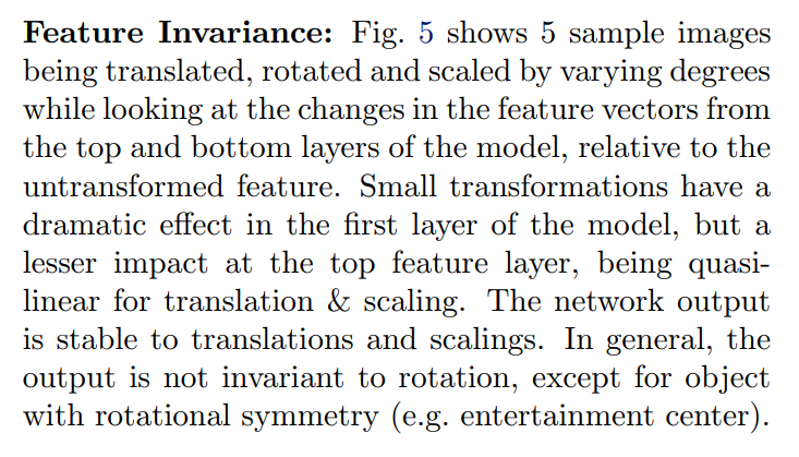
The Experiment: Shaking the Image
The experimental setup is simple but effective:
- Take an image and pass it through the trained network. Record the vector of activations (the feature vector) at Layer 1 and Layer 7. Layer 1 represents the lowest-level features, while Layer 7 (the last fully-connected layer) represents the highest-level semantic understanding before the final classification.
- Now, systematically transform the original image: move it (translate), zoom it (scale), and turn it (rotate).
- For each transformed image, pass it through the network and again record the feature vectors from Layer 1 and Layer 7.
- Finally, measure the difference (the Euclidean distance) between the feature vector of the original image and the feature vector of each transformed image. A small difference means the representation is stable and invariant; a large difference means it’s sensitive and brittle.
The Results: Invariance is Learned, Not Given
The experiment yielded three crucial findings:
- Layer 1 is Brittle: Small transformations had a dramatic effect on the Layer 1 feature vector. This makes perfect sense. The filters in Layer 1 are just simple edge and color detectors. If you shift the image by a few pixels, a completely different set of these simple filters will activate, causing the feature vector to change significantly.
- Layer 7 is Stable: In contrast, the same transformations had a much smaller impact on the Layer 7 feature vector. This is the paper’s key insight in action. Through the hierarchical processing of the convolutional layers, the network has learned an abstract, semantic representation of the object. This high-level concept of “dog” is much less dependent on the precise location of the pixels. The stability of this high-level feature vector is what gives the network its robustness. Invariance isn’t a property of the input; it’s an emergent property learned by the deep layers of the network.
- Rotation is the Exception: The network was robust to translation and scaling, but it was generally not invariant to rotation. Why? Because the features themselves are not rotationally invariant. A “face” detector learns to find a pattern of “eyes above a nose above a mouth.” If you rotate the image 90 degrees, that spatial relationship is broken, and the detector will not fire. The only exception was for objects that are naturally symmetrical, where rotation doesn’t change the object’s appearance. This finding highlights a key limitation of standard CNNs and underscores the importance of including rotated images in the training data via augmentation if rotation invariance is desired.
4.1. Architecture Selection
Up to this point, visualization has been used to understand a pre-existing, trained model. Now, the authors show its true power: using it to “debug” an architecture and guide the design of a better one. They turn their microscope on the champion of the day, AlexNet, and find some surprising flaws.
Diagnosing the Problems in AlexNet
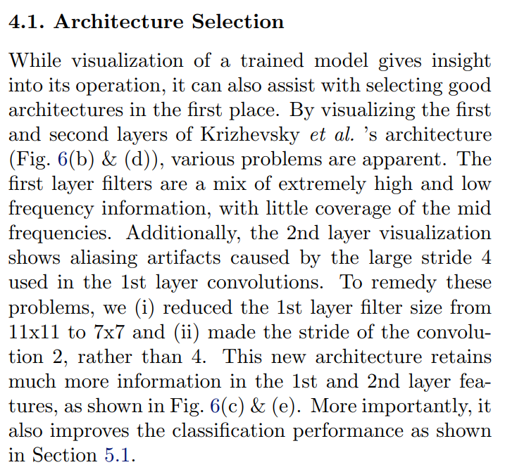
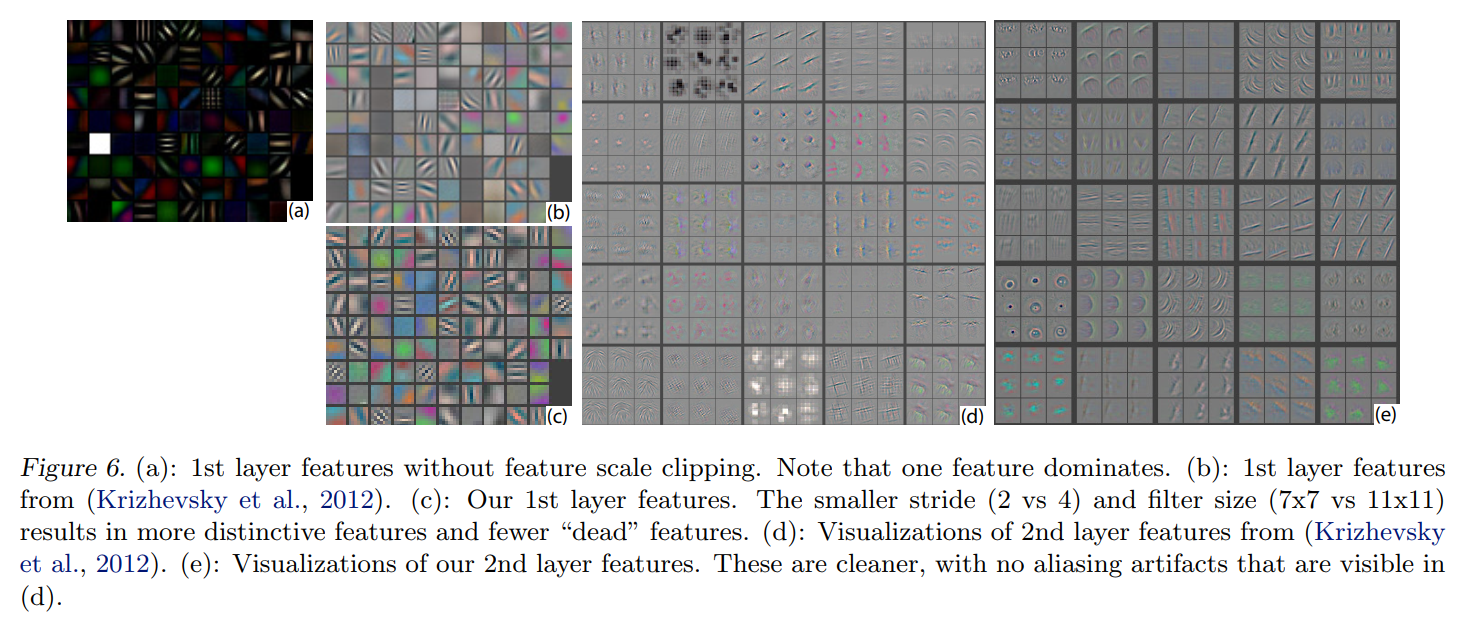
By looking at the internals of AlexNet (panels b and d in Figure 6), the authors identified two significant problems:
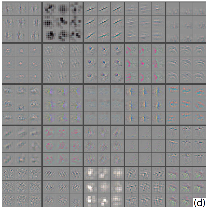
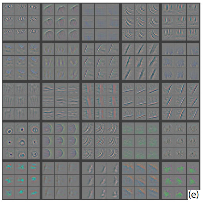
- Problem 1: Wasted Filters in Layer 1. As seen in Figure 6(b), AlexNet’s first-layer filters are not ideal. Many filters are either just blurry color blobs (low frequency) or noisy, high-frequency patterns. Very few filters are learning the clean, “mid-frequency” edge detectors that are most useful. It’s as if the network is wasting its capacity on features that are either too simple or too noisy to be helpful. Furthermore, as shown in Figure 6(a), some filters develop huge magnitudes and “dominate” the others, preventing them from learning anything useful.
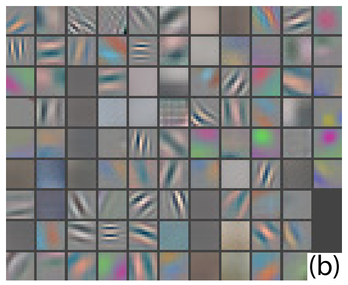
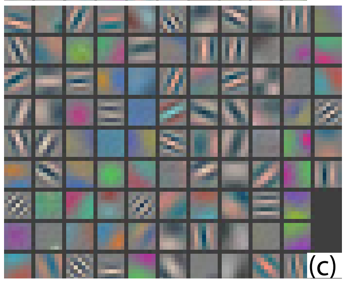
- Problem 2: Aliasing Artifacts in Layer 2. The visualizations of AlexNet’s second layer (Figure 6(d)) show prominent grid-like, repetitive artifacts. This is a classic signal processing problem called aliasing. It happens when you sample a signal too sparsely. AlexNet’s first layer used a very large stride of 4, meaning its filters jumped 4 pixels at a time. This was too big of a leap, causing the network to miss information and create these strange, unnatural patterns in the next layer. The network was essentially learning artifacts of its own architecture rather than true features of the images.
The Solution: A More Considered Architecture (ZFNet)
Armed with this clear diagnosis, the authors proposed two simple but impactful changes to the first layer’s architecture:
To remedy these problems, we (i) reduced the 1st layer filter size from 11x11 to 7x7 and (ii) made the stride of the convolution 2, rather than 4. This new architecture retains much more information in the 1st and 2nd layer features, as shown in Fig. 6(c) & (e). More importantly, it also improves the classification performance as shown in Section 5.1.
The fix was straightforward:
- Reduce filter size from 11x11 to 7x7: An 11x11 filter is very large for the first layer. By reducing it to 7x7, each filter focuses on a smaller, more appropriate region, encouraging it to learn simpler, more fundamental features like edges rather than complex patterns.
- Reduce stride from 4 to 2: This is the direct fix for the aliasing. By sampling the input image more densely, the network avoids creating artifacts and captures much richer, more detailed information from the input.
The visual results of these changes, which define their new “ZFNet” model, are striking:
- A Better Layer 1: Comparing AlexNet’s filters in 6(b) to ZFNet’s in 6(c), the improvement is obvious. The ZFNet filters are much cleaner, more distinct, and show a beautiful array of well-defined edge detectors at different orientations and colors. There are far fewer “dead” or blurry filters.
- A Cleaner Layer 2: Comparing AlexNet’s aliased features in 6(d) to ZFNet’s in 6(e), the difference is night and day. The artificial grid patterns are completely gone. In their place, ZFNet’s second layer has learned a rich vocabulary of cleaner, more complex features like curves, circles, and more intricate corners.
4.2. Occlusion Sensitivity
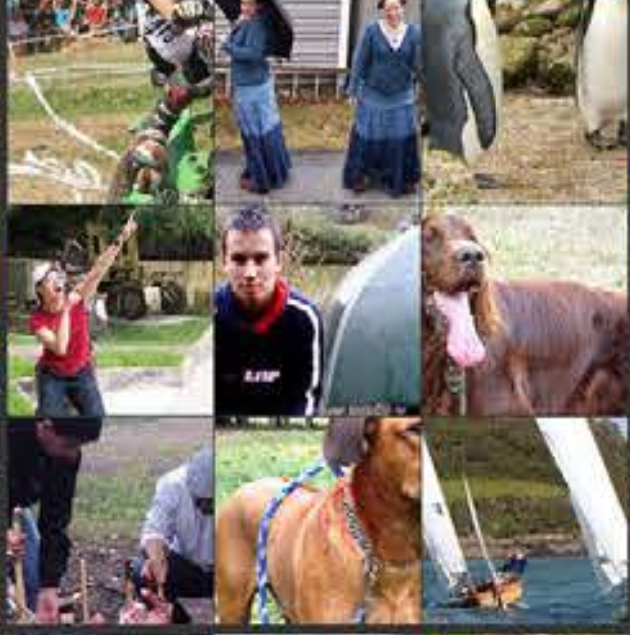
A major concern with any image classifier is whether it’s truly identifying the object of interest or just “cheating” by using the surrounding context. For instance, does a model classify an image as “boat” because it recognizes the boat, or because it recognizes the water the boat is on? To answer this, the authors devised a simple but powerful experiment called occlusion sensitivity.
The Occlusion Experiment
With image classification approaches, a natural question is if the model is truly identifying the location of the object in the image, or just using the surrounding context. Fig. 7 attempts to answer this question by systematically occluding different portions of the input image with a grey square, and monitoring the output of the classifier…
The experiment is straightforward:
- Take an input image.
- Systematically slide a gray square (an “occluder”) across every possible location in the image.
- At each position of the square, feed the partially covered image to the network and record the classifier’s output probability for the correct class.
- Create a 2D heatmap where the color at each pixel represents the probability the network assigned when that pixel was at the center of the occluder.
If the network is truly focused on the main object, then covering up that object should cause a sharp drop in the classifier’s confidence.
Figure 7: Visualizing the Impact of Occlusion
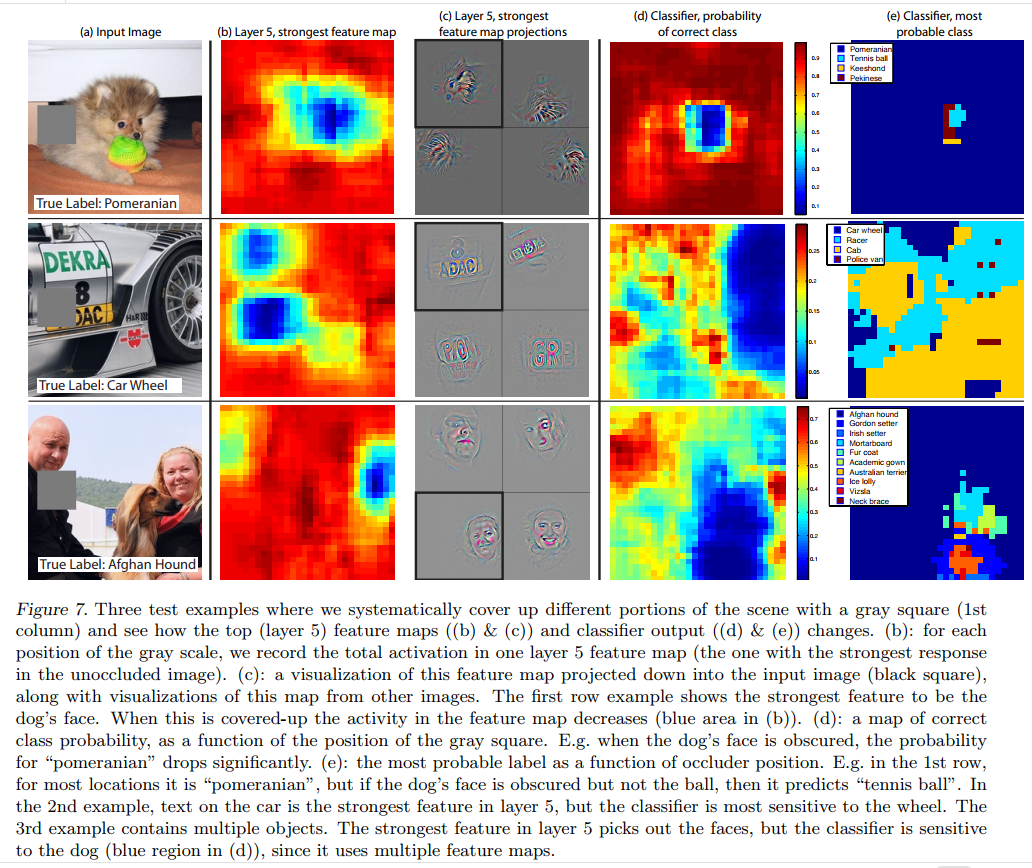
This figure is a brilliant visualization of the experiment’s results. Let’s walk through the first example, the Pomeranian, from left to right.
- (a) Input Image: The original image, correctly labeled “Pomeranian.”
- (b) Layer 5, strongest feature map: This is a heatmap showing which feature in the top convolutional layer fired most strongly, and where it fired. The red/yellow spot shows a massive activation right on the dog’s face.
- (c) Feature map projections: These are the deconvnet visualizations for the feature identified in (b). They confirm that this feature is indeed a “small furry face” detector.
- (d) Classifier, probability of correct class: This is the result of the occlusion experiment. The red/yellow areas are where the model was still confident in the “Pomeranian” class, even with the occluder present. The deep blue “hole” shows exactly where the occluder caused the model’s confidence to plummet. Critically, this blue hole is perfectly aligned with the dog’s face. This is the smoking gun: the model’s ability to classify the image as a Pomeranian is critically dependent on seeing the dog’s face.
- (e) Classifier, most probable class: This map shows which class the model predicted with the highest confidence for each occluder position. For most locations, the prediction is “Pomeranian” (purple). But when the occluder covers the dog’s face, the prediction changes to “Tennis ball” (blue)! This provides incredible insight: with the primary evidence gone, the model defaults to the next most likely object in the scene.
A Powerful Cross-Validation
When the occluder covers the image region that appears in the visualization, we see a strong drop in activity in the feature map. This shows that the visualization genuinely corresponds to the image structure that stimulates that feature map, hence validating the other visualizations shown in Fig. 4 and Fig. 2.
The authors make a final, crucial point. The region that causes the biggest drop in classification probability (the blue hole in panel d) is the exact same region that the deconvnet visualization identified as the key stimulus (the face in panel c).
This is a powerful cross-validation. It proves two things simultaneously:
- The model is honest: It is genuinely localizing and using the object for classification, not just the background context.
- The deconvnet is accurate: The patterns highlighted by the deconvnet are not just pretty pictures; they are a faithful representation of the image features that are causally important for the network’s final decision. This lends significant credibility to all the other visualization results in the paper.
4.3. Correspondence Analysis
Classical computer vision systems were often built on explicit, part-based models. For example, a face detector might have been programmed with the rule that “a face consists of two eyes above a nose, which is above a mouth.” A Convolutional Neural Network has no such built-in knowledge. It just learns from pixels. This raises a fascinating question: can a CNN implicitly learn these spatial relationships and correspondences?
The Big Question
Deep models differ from many existing recognition approaches in that there is no explicit mechanism for establishing correspondence between specific object parts in different images… However, an intriguing possibility is that deep models might be implicitly computing them.
The authors want to know if the network has learned a consistent internal representation for semantic parts. When the network “sees” the left eye of Dog A and the left eye of Dog B, does it activate a similar set of internal neurons? If it does, it suggests the network has learned the concept of a left eye, not just the specific pixels of one dog’s eye.
The Experiment: Consistent Occlusion
To test this, they design another clever occlusion experiment, shown in Figure 8.
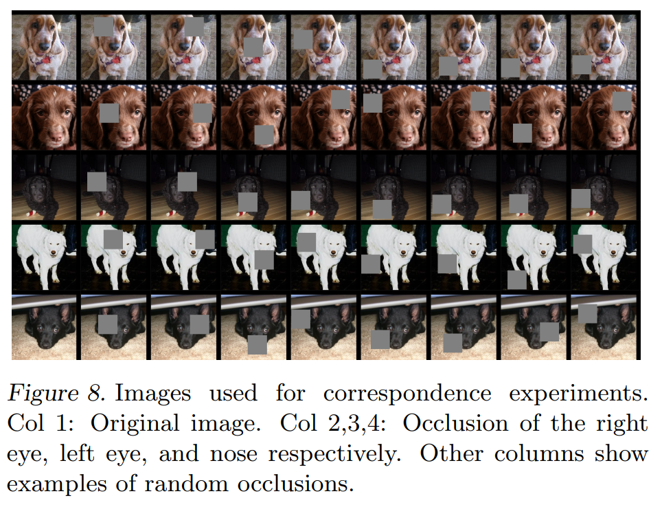
- The Setup: They take 5 different images of dogs, all in a similar frontal pose.
- The Intervention: They systematically occlude the exact same semantic part in each image. First, they cover the right eye of all 5 dogs. Then, the left eye of all 5 dogs. Then, the nose of all 5 dogs. As a control, they also cover random patches on each dog.
- The Measurement: For each occlusion, they measure the change it causes in the network’s feature representation at a given layer (Layer 5 and Layer 7). This “change vector” is like a neural signature of the disruption caused by hiding that part.
- The Analysis: They then compare these “change vectors” across the 5 different dogs. The key question is: Does hiding the left eye on all 5 dogs produce a more consistent change in the network’s brain than hiding a random patch on all 5 dogs? They use a metric (the Hamming distance between the signs of the change vectors) to get a single number representing this consistency. A lower score means more consistency.
The Results: Implicit Correspondence is Real
Table 1 shows the results, and they are remarkable.
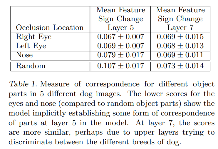
In Layer 5: The consistency scores for occluding the Right Eye (0.067), Left Eye (0.069), and Nose (0.079) are all significantly lower than the score for occluding a Random patch (0.107). This is the key finding. It means that hiding a specific facial feature causes a far more predictable and consistent change to the network’s internal state than hiding a random part of the dog. In other words, Layer 5 has implicitly learned a correspondence model. It has developed a consistent representation for key facial features across different dogs.
In Layer 7: The story changes. The scores for the eyes, nose, and random patches are all very similar (around 0.07). The special consistency has vanished. Why? The authors offer a brilliant hypothesis. Layer 5 is the top convolutional layer, responsible for building a spatial map of object parts. Layer 7 is a fully-connected layer, whose job is higher-level reasoning. They suggest that Layer 7 is using the subtle differences between the dogs’ eyes and noses to help discriminate between different breeds. At this higher level, it’s no longer interested in the general concept of “left eye,” but rather in what makes a poodle’s eye different from a beagle’s.
This is a profound result. It provides the first concrete evidence that CNNs, without any explicit programming, can learn structured, part-based knowledge about the world, further demystifying their incredible performance.
5.1. ImageNet 2012
After developing a new visualization tool and using it to diagnose and fix the architecture of a state-of-the-art model, the authors must answer the ultimate question: did it actually work? They now present their results on the premier computer vision benchmark of the era, the ImageNet 2012 classification challenge.
Step 1: Replicating the Baseline
Using the exact architecture specified in (Krizhevsky et al., 2012), we attempt to replicate their result on the validation set. We achieve an error rate within 0.1% of their reported value on the ImageNet 2012 validation set.
Before claiming their own model is better, the authors perform a crucial scientific sanity check: they first build an exact copy of the original AlexNet model to prove that their training setup is correct. As shown in Table 2, their replication of AlexNet achieves a 18.1% Top-5 validation error, which is almost identical to the 18.2% reported in the original AlexNet paper. This confirms they have a fair and accurate baseline for comparison.
Step 2: Demonstrating the Improvement (ZFNet vs. AlexNet)
Next we analyze the performance of our model with the architectural changes outlined in Section 4.1 (7×7 filters in layer 1 and stride 2 convolutions in layers 1 & 2). This model… significantly outperforms the architecture of (Krizhevsky et al., 2012), beating their single model result by 1.7% (test top-5).
This is the key result. They now test their own model (which would come to be known as ZFNet), incorporating the smaller 7x7 filters and smaller stride of 2 that were motivated by their visualizations.
Let’s look at the “single convnet” results in Table 2:
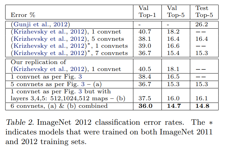
- AlexNet (replicated): 18.1% Top-5 Validation Error
- ZFNet (their model): 16.5% Top-5 Validation Error
This is a 1.6% absolute improvement, a massive leap in performance for a competitive benchmark like ImageNet. This is the quantitative proof that the “cleaner” and more diverse features they showed in Figure 6 directly translate to a more accurate model. The visual improvements were not just cosmetic; they were signs of a healthier, more powerful feature extractor.
Step 3: Pushing for the State of the Art
When we combine multiple models, we obtain a test error of 14.8%, the best published performance on this dataset…
To achieve the absolute best performance, it’s common practice to train several different models and average their predictions, a technique known as ensembling. The authors train several variations of their ZFNet and combine them. Their final, best ensemble achieves a 14.8% Top-5 Test Error.
This result is a landmark achievement:
- It decisively beats the best ensemble result from the original AlexNet paper (15.3%).
- It established a new state-of-the-art record for the ImageNet 2012 dataset at the time of publication.
To put this in perspective, the authors provide a final, stunning comparison: the best-performing model in the 2012 competition that did not use a convnet achieved an error rate of 26.2%. Their model’s error rate of 14.8% is nearly half that. This highlights not only the power of their specific improvements but the overwhelming dominance of the deep learning paradigm that their work helped to explain and advance.
Varying ImageNet Model Sizes: An Ablation Study
Where does a neural network’s power come from? Is it the sheer number of parameters? The number of layers (depth)? Or the size of each layer (width)? To investigate this, the authors take both the original AlexNet and their own improved ZFNet and systematically dissect them, measuring the performance of the crippled or modified networks.
In Table 3, we first explore the architecture of (Krizhevsky et al., 2012) by adjusting the size of layers, or removing them entirely… Removing the fully connected layers (6,7) only gives a slight increase in error. This is surprising, given that they contain the majority of model parameters.
Dissecting AlexNet: Key Findings
By looking at the top half of Table 3, we can see a few surprising results:
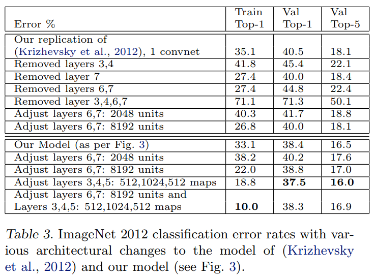
- The Fully-Connected Layers are Overrated: Layers 6 and 7 are massive, containing tens of millions of parameters—the vast majority of the model’s total size. Yet, removing them entirely (
Removed layers 6,7) only increases the Top-5 error from 18.1% to 22.4%. While this is a drop in performance, it’s surprisingly small, suggesting that the convolutional layers are doing most of the heavy lifting in feature extraction. - The Network has Some Redundancy: Removing two of the middle convolutional layers (
Removed layers 3,4) has a similar effect, increasing the error to 22.1%. The network is robust enough to compensate for the loss of some of its intermediate feature extractors. - Depth is Absolutely Critical: The most telling experiment is
Removed layers 3,4,6,7. When they remove both the middle convolutional layers and the fully-connected layers, the performance completely collapses, with the error skyrocketing to 50.1%. This is the key takeaway: while individual layers can be removed with a manageable performance hit, the overall depth of the network is essential for building the hierarchical features needed for accurate classification.
Improving ZFNet: Where to Spend Your Parameter Budget
The authors then apply the same investigative logic to their own, better-performing model (bottom half of Table 3).
Changing the size of the fully connected layers makes little difference to performance… However, increasing the size of the middle convolution layers does give a useful gain in performance. But increasing these, while also enlarging the fully connected layers results in over-fitting.
This analysis yields two crucial insights for architecture design:
- Invest in Convolutional Layers: The single most effective change they made was increasing the “width” of the middle convolutional layers (
Adjust layers 3,4,5: 512,1024,512 maps). By adding more feature maps, they gave the network a richer capacity to learn diverse patterns. This change alone dropped their validation error from 16.5% to 16.0%, a significant improvement. This proves that the most valuable place to add parameters is in the feature-extracting convolutional core of the network. - Beware of Overfitting: What happens if you just make everything bigger? The last row of the table shows the result. They increase the size of both the convolutional layers and the fully-connected layers. The result is a classic case of overfitting. The training error plummets to just 10.0% (the model is memorizing the training set), but the validation error (38.3% Top-1) is now worse than their baseline model. The model has become too powerful and complex for the amount of data available, losing its ability to generalize to new images.
This set of experiments provides a clear prescription for building better models: prioritize the depth and capacity of the convolutional layers, as this is the engine of feature learning, and be cautious about adding too much capacity to the fully-connected layers, as it can easily lead to overfitting.
5.2. Feature Generalization
Having demonstrated the power of their model on ImageNet, the authors now tackle a more profound question. Are the features learned on ImageNet—the edge detectors, texture patterns, and object parts—only useful for that specific 1000-class problem? Or has the network learned a fundamental, general-purpose “visual grammar” that can be applied to other tasks?
The Grand Experiment: Transfer Learning
The experiments above show the importance of the convolutional part of our ImageNet model in obtaining state-of-the-art performance… We now explore the ability of these feature extraction layers to generalize to other datasets, namely Caltech-101, Caltech-256 and PASCAL VOC 2012. To do this, we keep layers 1-7 of our ImageNet-trained model fixed and train a new softmax classifier on top (for the appropriate number of classes) using the training images of the new dataset.
The experiment they propose is the classic recipe for transfer learning. Instead of building and training a new network from scratch for a new dataset (like Caltech-101), they treat their pre-trained ImageNet model as a fixed, off-the-shelf feature extractor.
The process is simple:
- Take an image from the new dataset (e.g., Caltech-101).
- Pass it through the frozen convolutional and fully-connected layers (Layers 1-7) of the ImageNet-trained ZFNet.
- The output of Layer 7 is a 4096-dimensional vector. This vector is the network’s rich, high-level feature representation of the input image.
- Use these feature vectors as the input to train a new, simple softmax classifier that is tailored to the classes of the new dataset.
The intuition here is powerful: the first seven layers of the network have already learned how to “see.” They know how to transform raw pixels into a meaningful, semantic representation. The only part that is specific to the ImageNet task is the final softmax classifier that maps those features to 1000 classes. By swapping out just this final layer, they can rapidly “retarget” the network’s powerful visual understanding to a new problem.
Ensuring a Fair Fight: Hand-Crafted vs. Learned Features
The classifiers used by our model (a softmax) and other approaches (typically a linear SVM) are of similar complexity, thus the experiments compare our feature representation, learned from ImageNet, with the hand-crafted features used by other methods.
This is a crucial point of comparison. Before deep learning, the standard approach in computer vision was to use hand-crafted features. These were algorithms like SIFT, SURF, or HOG, designed by human experts to extract specific kinds of information (like edge orientations) from images. Researchers would run these algorithms to generate feature vectors and then feed them into a classifier like a Support Vector Machine (SVM).
The authors argue that this is a fair comparison because both their learned features and the hand-crafted features are, in a sense, “pre-trained.” The parameters and design choices for algorithms like HOG were refined over years of research on other datasets (like pedestrian detection). This experiment, therefore, pits two philosophies against each other: human-designed features vs. features learned automatically from a large dataset.
The Crucial Control and Scientific Rigor
We also try a second strategy of training a model from scratch, i.e. resetting layers 1-7 to random values and train them, as well as the softmax, on the training images of the dataset.
To prove that the pre-trained features are the source of the power, they include a critical control experiment: training the same network architecture from scratch on the small Caltech datasets. They expect this to perform poorly, as a deep network with millions of parameters will severely overfit if trained on only a few thousand images.
One complication is that some of the Caltech datasets have some images that are also in the ImageNet training data… we identified these few “overlap” images and removed them from our Imagenet training set and then retrained our Imagenet models, so avoiding the possibility of train/test contamination.
This is a mark of excellent scientific practice. The authors discovered that their model might have an unfair advantage because it was already “trained” on some of the images it was being tested on. To ensure their results were honest, they went through the painstaking process of identifying these overlapping images, removing them, and retraining their entire multi-day ImageNet model from scratch. This demonstrates a deep commitment to a fair and rigorous evaluation.
The Results: A New State-of-the-Art in Transfer Learning
Caltech-101: A Solid Victory
Caltech-101: … The pre-trained model beats the best reported result for 30 images/class from (Bo et al., 2013) by 2.2%. The convnet model trained from scratch however does terribly, only achieving 46.5%.
On the Caltech-101 dataset, a standard benchmark with 101 object categories, the results were clear and decisive.
- The Power of Pre-training: Using their ImageNet-trained network as a feature extractor, the authors achieved a new state-of-the-art result, beating the previous best method (which used complex hand-crafted features) by a solid 2.2%. Remarkably, training the new classifier on top took only 17 minutes.
- The Failure of Training from Scratch: The control experiment was just as important. When they tried to train the same deep network architecture from scratch on the small Caltech-101 dataset, the model failed catastrophically, achieving only 46.5% accuracy. This proves that the network’s success was not due to the architecture itself, but to the rich, general features it had already learned from ImageNet.
Caltech-256: A Landslide Victory
Caltech-256: … Our ImageNet-pretrained model beats the current state-of-the-art results obtained by Bo et al. (Bo et al., 2013) by a significant margin: 74.2% vs 55.2% for 60 training images/class… With our pre-trained model, just 6 Caltech-256 training images are needed to beat the leading method using 10 times as many images.
If the Caltech-101 result was a solid win, the Caltech-256 result was a knockout.
- Dominant Performance: The pre-trained ZFNet didn’t just beat the previous state-of-the-art; it obliterated it, improving the accuracy from 55.2% to 74.2%—an incredible 19% absolute improvement.
- Incredible Data Efficiency: The authors highlight a truly stunning finding. Their pre-trained model, when trained on just 6 images per class, was more accurate than the previous best method that used 60 images per class. This is the ultimate testament to the power of transfer learning. The network’s deep visual knowledge, learned from ImageNet, allowed it to generalize to a new task with an astonishingly small amount of new data.
PASCAL 2012: A Stress Test
PASCAL 2012: … This is not ideal, as PASCAL images can contain multiple objects and our model just provides a single exclusive prediction for each image… This may explain our mean performance being 3.2% lower than the leading (Yan et al., 2012) result, however we do beat them on 5 classes, sometimes by large margins.
The PASCAL VOC dataset presented a different and more difficult challenge. Unlike ImageNet and Caltech, which mostly contain images of a single, centered object, PASCAL images are complex scenes that often contain multiple objects.
- A Known Mismatch: The authors are upfront about the limitations of their approach here. Their model is designed for single-label image classification, making it a poor tool for a multi-label scene understanding task.
- Honest and Nuanced Results: As expected, their model did not beat the overall state-of-the-art on this dataset. However, the fact that it was even competitive is remarkable. More impressively, their method still managed to set a new state-of-the-art on 5 of the 20 classes in the dataset.
Collectively, these three experiments provided the definitive proof: training a deep CNN on a massive, diverse dataset like ImageNet doesn’t just create a good ImageNet classifier. It creates a powerful, general-purpose visual feature extractor that can be transferred to achieve state-of-the-art results on a wide range of other computer vision tasks, especially when data for the new task is scarce. This insight has become a cornerstone of modern computer vision.
5.3. Feature Analysis
We know that using the pre-trained network as a feature extractor works brilliantly. But which layer provides the most powerful features? Are the simple edge detectors from Layer 1 enough? Or do we need the highly abstract object-part detectors from Layer 5? To answer this, the authors perform one final, elegant experiment.
The “Layer-by-Layer” Experiment
We explore how discriminative the features in each layer of our Imagenet-pretrained model are. We do this by varying the number of layers retained from the ImageNet model and place either a linear SVM or softmax classifier on top.
The setup is simple. They “tap into” the network at different depths. First, they take the output of Layer 1, use it as a feature vector, and train an SVM classifier on it. Then they repeat the process, but this time using the more complex features from the output of Layer 2, and so on, all the way up to Layer 7. By comparing the performance of these classifiers, they can directly measure the “discriminative power” of the features at each stage of the hierarchy.
The Results: A Clear Ascent
The results, shown in Table 7, paint a crystal-clear picture.
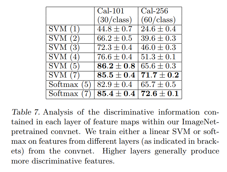
For both datasets, a steady improvement can be seen as we ascend the model, with best results being obtained by using all layers. This supports the premise that as the feature hierarchies become deeper, they learn increasingly powerful features.
Looking at the Caltech-101 column, we can follow the story:
- Layer 1: Using only simple edge and color features yields a meager 44.8% accuracy.
- Layer 2: Adding corners and curves immediately boosts performance to 66.2%.
- Layers 3 & 4: As textures and object parts are incorporated, the accuracy continues to climb steadily to 72.3% and 76.6%.
- Layer 5: The features from the top convolutional layer, which represent complex object parts, provide a massive jump to 86.2%.
- Layer 7: The final, most abstract features from the fully-connected layer give a similar top performance of 85.5%.
The trend is undeniable. Each successive layer of the network builds a more powerful, more semantically rich, and more useful representation of the input image. This table provides the definitive quantitative evidence to support the visual story told in Figure 2. The network’s depth is not an accident; it is the essential ingredient that allows it to transform simple pixels into the abstract concepts needed for high-level visual recognition.
6. Discussion and Conclusion
In this final section, the authors tie together all the threads of their investigation, summarizing their achievements and looking forward to the future. The paper tells a complete story, from developing a new tool for understanding, to using that tool for improvement, and finally, to demonstrating the profound implications of what these models learn.
A Summary of Contributions
We explored large convolutional neural network models, trained for image classification, in a number ways. First, we presented a novel way to visualize the activity within the model. This reveals the features to be far from random, uninterpretable patterns. Rather, they show many intuitively desirable properties such as compositionality, increasing invariance and class discrimination as we ascend the layers. We also showed how these visualization can be used to debug problems with the model to obtain better results, for example improving on Krizhevsky et al.’s impressive ImageNet 2012 result. We then demonstrated through a series of occlusion experiments that the model, while trained for classification, is highly sensitive to local structure in the image and is not just using broad scene context. An ablation study on the model revealed that having a minimum depth to the network, rather than any individual section, is vital to the model’s performance.
This first paragraph is a concise and powerful summary of the paper’s entire first half. They recount their journey:
- They built a tool to see inside the black box: The deconvnet revealed that the internal features of a CNN are not a random mess, but a structured, interpretable, and hierarchical representation of the visual world.
- They proved this tool has practical value: They used the deconvnet to diagnose specific flaws (large stride, oversized filters) in the state-of-the-art AlexNet model and proposed targeted fixes that led to their superior ZFNet. This is the paper’s core thesis: understanding enables improvement.
- They validated their findings with supporting experiments: The occlusion studies proved the model was “honest” and truly localizing objects. The ablation studies proved that the network’s overall depth is the most critical architectural ingredient for success.
The Broader Impact: The Dawn of Transfer Learning
Finally, we showed how the ImageNet trained model can generalize well to other datasets. For Caltech-101 and Caltech-256, the datasets are similar enough that we can beat the best reported results, in the latter case by a significant margin. This result brings into question to utility of benchmarks with small (i.e. < 10^4) training sets. Our convnet model generalized less well to the PASCAL data, perhaps suffering from dataset bias (Torralba & Efros, 2011), although it was still within 3.2% of the best reported result, despite no tuning for the task.
Here, the authors reflect on the second, and arguably more impactful, contribution of their work: proving the power of transfer learning.
- The Power of Pre-trained Features: Their ImageNet model wasn’t just an ImageNet specialist; it was a powerful, general-purpose feature extractor that shattered state-of-the-art records on other datasets (Caltech-101 and Caltech-256) with minimal effort.
- A Challenge to the Status Quo: In a remarkably prescient statement, they question the future of small-scale benchmarks. They argue that if a model pre-trained on a massive dataset can easily dominate these smaller challenges, then the real competition is no longer about designing clever algorithms for small data, but about building and understanding large-scale models. This insight has profoundly shaped the direction of AI research in the years since.
- An Honest Look at Limitations: They are transparent about their weaker performance on the PASCAL dataset. They correctly diagnose the problem as a dataset bias and a task mismatch. ImageNet images are typically single, centered objects, while PASCAL contains complex scenes. The features learned from ImageNet are therefore less suited to this different data distribution. This acknowledgment of limitations and potential avenues for improvement (e.g., using a different loss function for multi-object scenes) is the hallmark of excellent research.
The Legacy of “Visualizing and Understanding”
This paper is a landmark in the history of deep learning. Its contribution was not just in building a better model, but in changing how researchers thought about models in the first place. By providing one of the first clear, compelling glimpses inside the “black box,” Zeiler and Fergus transformed the field’s approach from one of trial-and-error alchemy to one of principled, diagnostic-driven engineering. They demonstrated that understanding and performance are not separate goals, but two sides of the same coin, paving the way for the more sophisticated architectures and interpretability techniques we have today.